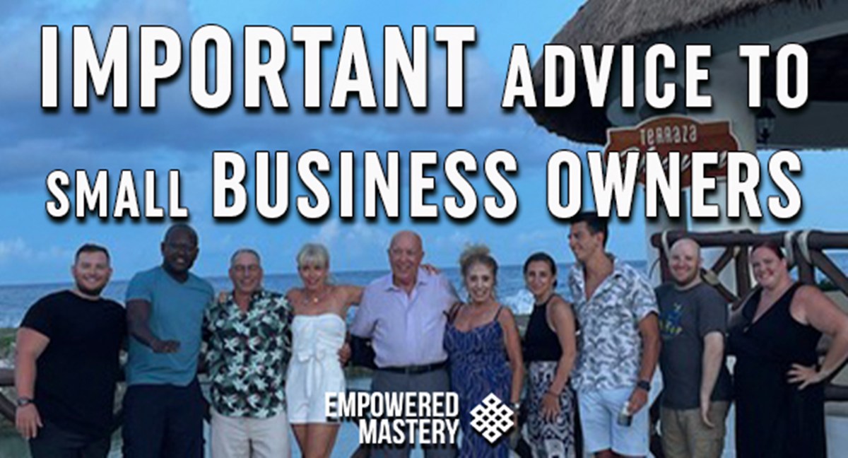
Hardly anything gets us more excited than to talk about Empowered Mastery’s recent rebrand: Our new icon and brand colors truly embody everything that we represent and hope to instill in our clients. As a result, we wanted to pen a blog about just what everything means to us—and hopefully to you, too.
Our Icon: The Endless Knot
In 2017, Empowered Mastery Cofounder Chris Berlow traveled to Nepal to hike in the Himalayas—specifically to climb legendary Kala Patthar and Mount Everest Base Camp. At the end of the wild and challenging journey, Chris’s sherpa gifted him with a charm—one of the Tibetan Buddhist eight auspicious signs—the endless knot.
Chris learned that it represented the balance of all living things on earth and the connection between one’s spiritual path and the movement of time. The symbol itself is an intricate pattern of interlacing lines and never-ending loops reminding us of the interconnectivity of all beings in space and time.
 “This is me, this is what I believe in,” Chris told himself, and he has worn the endless knot around his neck ever since.
When Chris shared this story with Empowered Mastery Cofounder Paul Melella, Paul was fundamentally moved. Just like that, Empowered Mastery established a new icon to represent its ideals and commitment to the individuals the company serves. Charged with helping its clients develop a deeper sense of balance and harmony in their lives, Chris and Paul recognized the significance of having the endless knot as a part of Empowered Mastery’s new brand. They teach appreciation of everything the world has to offer—and everything their clients have to offer the world—just as the endless knot inspires.
The Meaning of our Color
Orange: Energy & A Mix of Joy and Passion
 We were all in agreement about electing a fiery orange as one of our primary brand colors. Orange typically represents energy and creativity, which embodies much of what Empowered Mastery represents—a force of positive energy and creative thinking.
We toyed with choosing red, a color often associated with power, drive, and love as well as yellow, which represents light, joyfulness, enlightenment, and intellect.
Because we were torn, we felt orange was the perfect solution: a blending of all these connotations. We recognize that many of our clients identify with red—so extremely driven and focused that they forget to enjoy life. Through Empowered Mastery, we hope to introduce yellow to their busy lives—happiness and enlightenment—so that they can enjoy life to the fullest, and thus, we arrive at orange.
Blue: Wisdom & Trust
 Choosing blue was an easier decision for us. Blue represents exactly what we want to convey to our clients: trustworthiness and stability. Beyond that, blue represents confidence. This is something we instill in each of our clients. And finally, blue represents wisdom and knowledge—and that is exactly what the word mastery truly means. We have decades of experience in business, entrepreneurship, meditative thinking, and work-life balance that we want to share with each of our clients to help them achieve mastery in these aspects of life or whatever their objectives are when working with us.
Gray: Balance & Harmony
Gray was also an easy decision for us. If you know us—and even if you don’t, this is a good way to learn about us—gray is a color that really helps define our owners. Empowered Mastery Cofounder Paul Melella is tough and gritty alpha entrepreneur who cuts right through the B.S. to get results. He curses, he’s edgy, he drives a blacked-out Rubicon. Chris is, in some ways, the opposite of Paul. He is softer spoken, but equally driven. You’ll never catch him swearing. He gets results with a measured, encouraging approach.
They are yin and yang, and thus, gray is the combination of Paul’s darker, gritty mystique and Chris’s lighter, brighter more relaxed coaching style. They balance each other other, mixing black and white to create gray. This color represents the merging of these two extreme opposites to create balance and harmony, two other key qualities we hope to instill in our clients to achieve greater success.
A Different Look, The Same Ideals
 As you can see, a lot of time, thought, and passion was put behind our rebrand—the exact same attributes you can expect to see in any of our coaching and mentorship programs. While we may look like a different company, we are the same driven leaders as before. The only difference now is that we are even more fierce and vehement about getting you the results you’re hungry for. So let’s get to work.